Wed Jan 31 2024
How this website was built
Tags:
Contents
I always treat the development of this website as a playground for things I want to try out. The last update was no different! Here's an overview of some of the things I've done and decisions I've made along the way.
Secret Sauce
I got the inspiration for this post from the always amazing Syntax podcast - if you've never heard of it, give it a listen! In one of the episodes last year, they came up with this great idea of Secret Sauce - basically breaking down your website into some ideas and tech stack solutions you've chosen and challenges you've faced. That inspired me to talk about this site in particular: I feel like I've learned quite a lot in trying to get it to look and feel like it does now, and I've got to try some new exciting stuff, so here's a little reflection.
Stack: framework and styling
Framework: I treat this site as a playground for all things fun. Sure, using Next.js and SSR is a bit of an overkill for a portfolio + blog kind of thing, but a) I just enjoy working with Next.js a lot b) I recently tried RSC (React Server Components) for a technical assignment, which turned out to be quite awesome in performance and DX-wise, so I really wanted to try it in the wild, given the nature of the site.
Styling: Previous version ran styled-components, and I had this CSS-in-JS heavy period where it was my to-go styling method for too long. But, working on performance at work + using RSC/SSR, I've learned all the performance trade-offs that come with CSS-in-JS, so for this upgrade I went with CSS modules.
It was really, really interesting, more of a mental model switch:
- You finally rely a lot on CSS variables (which is awesome), my to-go approach with styled-components was to use theme variables (so lots of boilerplate code 🫠).
- I was really confused about media queries and made all sorts of rookie mistakes: not having written pure CSS for so long, I wrote media queries in random order when it mattered a lot, tried to put them inside the css rules when it should be the other way around (dunno why, styled-components, man), and struggled with calculations.
/* What I did: */
/* (funny enough, _now_ it is possible due to the native css nesting!) */
.className {
width: 100%;
@media (max-width: 900px) {
width: 100%;
}
}
/* What you are supposed to do: */
.className {
width: 100%;
}
@media (max-width: 900px) {
.className {
width: 100%;
}
}
- CSS code looks awesome, clean and simple. JSX... not so much with
styles.classNamethings. The upside is that reading styled-components JSX doesn't tell you much about semantics - you have to look in your styles (usually a separate file) to check what's being used and where. With CSS modules, JSX really is HTML.
With CSS Modules:
<article className="{styles.article}">
<h2 className="{typographyStyles.h2}">Header</h2>
<figure>
<img src="image.jpg" className="{styles.articleImage}" />
<figcaption className="{styles.imageCaption}">Caption</figcaption>
</figure>
<p className="{styles.content}">
This is how everything looks with CSS modules.
</p>
<p className="{styles.content}">You can see tags perfectly</p>
<p className="{styles.content}">
But there're a lot of classes, which might be difficult to read.
</p>
</article>
<SomeOtherComponent />
With styled-components:
<Article>
<Subheading>Header</Subheading>
<figure>
<ArticleImage src="image.jpg">
<ImageCaption>Caption</ImageCaption>
</figure>
<Paragraph>With styled-components, the markup is cleaner</Paragraph>
<Footer>But semantics are harder to follow.</Footer>
</Article>
<SomeOtherComponent/>
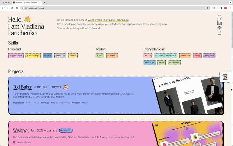
Design
I'm just not very good at designing things. Ok, maybe not that bad, but it definitely takes a lot of trial and error to make something look good. For this version, I've taken inspiration from all over, especially the neubrutalism trend that's been going on lately, plus defined vibrant colours, borders and sleek typography.
I usually design directly in the browser, trying things out with code rather than drawing and moving things around in Figma or elsewhere. his helps to identify tokens and design them right away: spacings, colours, sizes, fonts, and, in my case, also borders.
I also wanted to preserve the cards animation I've used over the years - for some reason I love it so much I didn't want to let it go, at least not just yet.
React Server Components all the way
I have little to none client-side functionality, so it made sense to go all in with React Server Components. And, as mentioned above, I really wanted to try it in production.
If you haven't tried RSC yet, I highly recommend it! If you have no idea what I'm talking about, check this breakdown: Josh Comeau: Making Sense of React Server Components
I had some of challenges along the way: I still had a few of components where I had some interactivity and/or state. My previous mindset would be just to reach for the usual stuff: useState, useContext, useEffect and what not, but here, doubling down on server components, what do I do? Sure, there's always a way to mark these components as use client, since we can use client components in server ones and even vice versa. In my case, this was sometimes plausible, but othertimes it set off a chain reaction with tiny components affecting big ones, causing them to become client-side as well. So one of the ways to solve this was to actually use Vanila JS + CSS specifically for interactions, where it was possible.
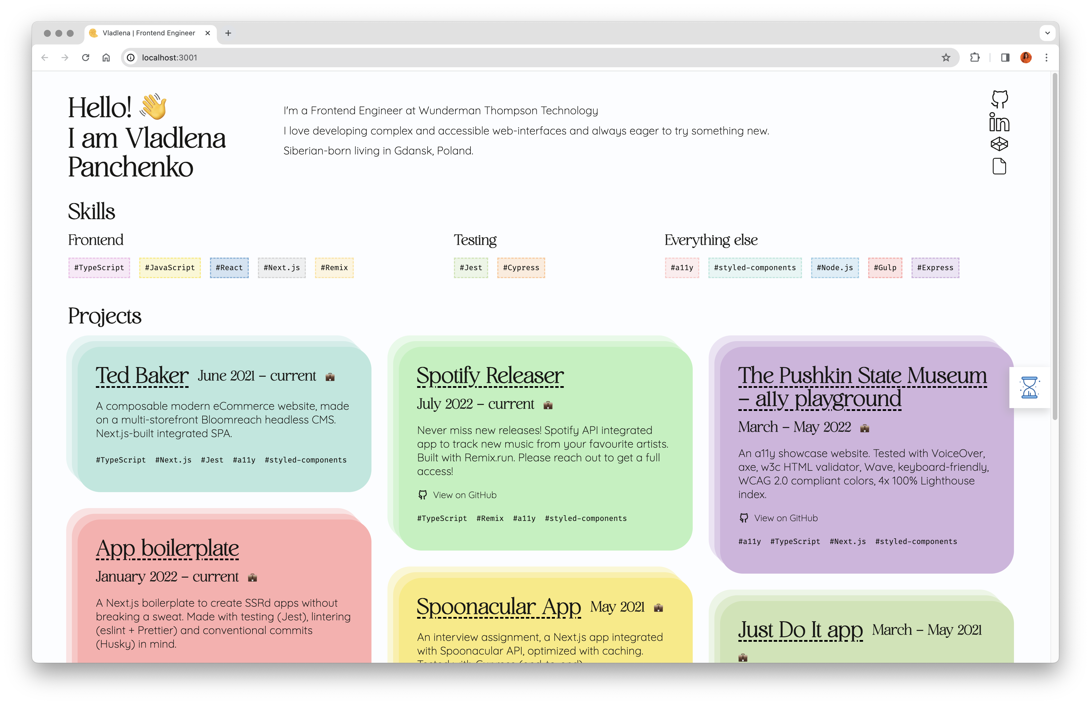
For example, I have this tags functionality that filters out relevant posts:
The filtering does not really happen on the data side. The cards are rendered entirely as RSCs, and I didn't want to touch that, so all the whole logic is done through <Tags>:
- Tags are client components. They are relatively small, so have no effect on layout shifts, while cards are better to be rendered on the server due to inconsistent heights + images.
- Tags keep all information about the currently selected tag. Since it is a client component, I can use
useState. - Via
<Tags>and using vanilla JS, I can simply toggle appropriate classes to hide/show approprate cards. This behaviour is only relevant on the client side, and I don't really need to align server and client in this case, so CSS-based interaction works just fine.
// simplified code, basic class toggling functionality
// <Labels>, a client side component (which is still SSRd, by the way)
const handleClick = (tag: string) => {
const cards = document.querySelectorAll(`.card`);
for (let card of cards) {
if (!card.classList.contains(tag)) {
card.classList.add("hidden");
} else card.classList.remove("hidden");
}
};
It was fun to reach for the CSS solution, because years of working with React mess with your head just enough for you to automatically to start filtering data, and that is not necessarily 100% the right approach.
CMS, data, posts
Again, a lot of experimentation:
- Notion as a DB/makeshift CMS: not impressed with the experience so far. Row-based content is fine, but Notion-specific datatypes make the API really messy (
row.properties.content.rich_text[0].plain_text, wow, why?). - Markdown-based blog post dataflow: I write this post in Markdown with the occasional HTML tags when I feel the need for it. The
.mdfiles are parsed using remark and a ton of plugins: remark-heading-id to make header ids work (as in Contents here), remark-rehype and rehype-raw for full HTML tag support, and rehype-starry-night to prettify code snippets. Never thought it would be this complex to make Markdown work, think there must be a better way...
Time machine!
I had this idea for quite a while, to keep track of all the previous "editions" of this portfolio to look back at. Also, I am very meticulous about streaks and traditions, so it seemed like a good idea to create a way to make myself update this site every year.
Fun (?) facts:
- First version (2020-2021) was done with
gulp.jsand was all vanilla. Later on I switched toNext.js - 2020 version was completed entirely in two weeks in a hospital. That's what you do when you have a lot of time (and relatively manageable pain), don't you?
- It has always been orange-y. Is there a specific reason for that? No. Do I like the colour orange? Somehow also no. ???
- The most dramatic change has been the way I write CSS, I went from
SASStostyled-componentstoCSS modules. We'll see what comes next!
Final thoughts
It was fun to document the experience. I certainly learned a lot about RSC, tried some modern CSS with :has and container queries, and stretched my UI design skills (and struggled a lot about it). See you next year in a similar guide?